Visualization
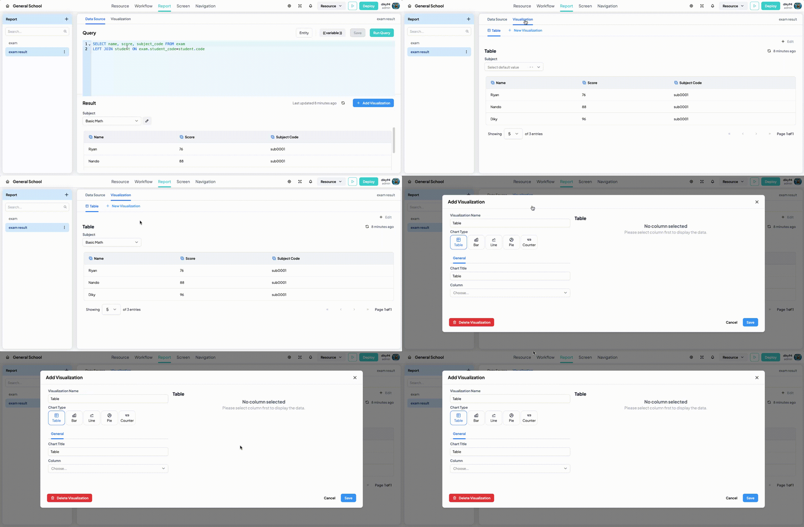
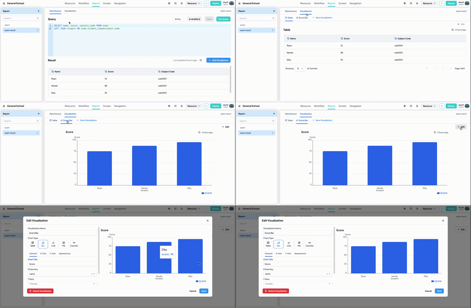
Visualization is visual representations of data. Visualizing data helps to uncover patterns, trends, and relationships in your data. In a report, you can create more than one visualization. By default, a visualization with type Table is created automatically on a report.
Creating a New Visualization
-
Open New Visualization Modal
There are two ways to open the new visualization modal :
-
From Data Source tab, Click Add Visualization button on top right of the Result section.

-
From Visualization tab, Click tab Visualization then Click New Visualization button

-
-
Enter a unique Visualization Name.
-
Select a Visualization Type. At this time, there are 5 available visualization type Table, Bar Chart, Line Chart, Pie Chart, Counter:
Table
Tables are a powerful tool for visualizing data that requires precise, detailed, and comprehensive presentation. They are particularly useful for large datasets, multiple categories, and scenarios where exact values need to be displayed and compared.
Property:
Name Description Example Title The title of table List of employee Column Settings for each column to be displayed in the table Employee name, Gender Bar Chart
Bar charts are a powerful tool for visualizing categorical data due to their simplicity, versatility, and ability to highlight key trends and comparisons effectively.
Property:
Name Description Example Title The title of table List of employee X Axis Data Selected data for xAxis Name, Date Y Axis Data Selected data for yAxis Score, Sales Show Legend Show or hide the Legend - Show Data Tooltip Show or hide the data tooltip when the bar is hovered - XAxis Title Title of X Axis Name YAxis Title Title of Y Axis Sales Color The color of the Bar blue, green Line Chart
Line charts excel at showing trends and patterns by connecting data points with continuous lines
Property:
Name Description Example Title The title of table List of employee X Axis Data Selected data for xAxis Name, Date Y Axis Data Selected data for yAxis Score, Sales Show Legend Show or hide the Legend - Show Data Tooltip Show or hide the data tooltip when the bar is hovered - XAxis Title Title of X Axis Name YAxis Title Title of Y Axis Sales Color The color of the Line points blue, green Pie Chart
Pie charts are excellent for displaying the proportions of a whole, making it easy to understand the relative sizes of different categories.
Property:
Name Description Example Title The title of table List of employee X Axis Data Selected data for xAxis Name, Date Y Axis Data Selected data for yAxis Score, Sales Color The color of the segment of each data blue, green Counter�
Counters are excellent for displaying specific value of the data compared to the target data.
Property:
Name Description Example Title The title of table List of employee Counter value column Selected column of the value data Sales Counter value row Selected row of the value data 0, 1, 2 Target value column Selected column of the target data Target sales Target value row Selected row of the target data 0, 1, 2 -
Provide a Chart Title that describes the visualization.
-
Choose the Selected Data for xAxis from your dataset.
-
Choose the Selected Data for yAxis from your dataset.
-
Configure any additional properties based on the selected chart type (e.g., bar color for bar charts, title of yAxis, etc).
-
Click Save button. Your visualization is now displayed on the Visualization Tab
Customizing Visualization
To edit current visualization, go to Visualization Tab and click Edit button on the top right of the visualization preview.

Change any property that you want to change. Then click Save