Checkbox
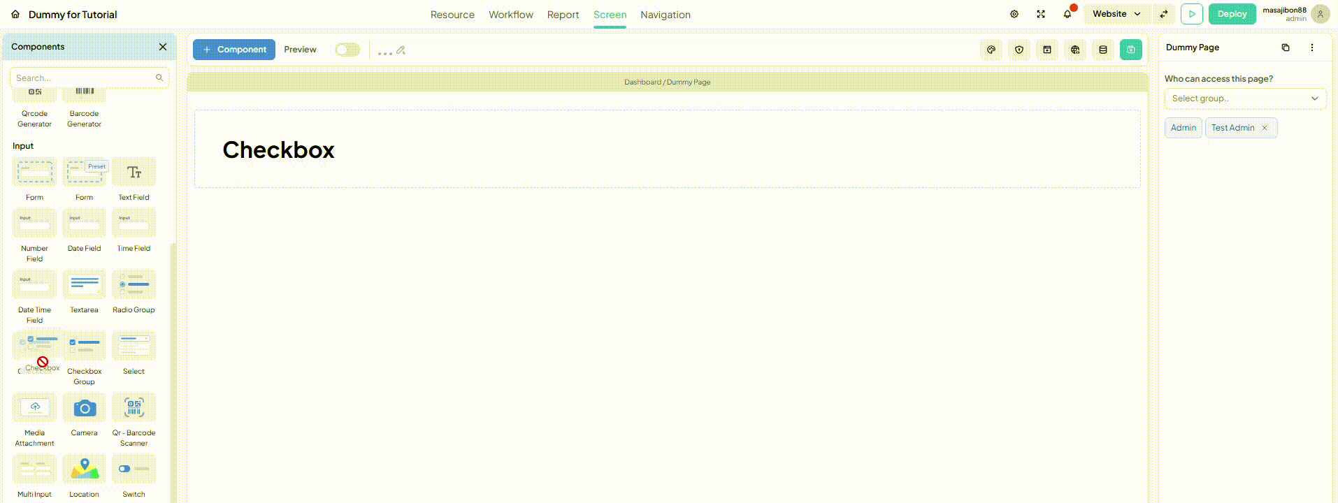
Checkbox component enables users to interact with options by selecting (checking) or deselecting (unchecking) them. It can only stores boolean data type (true/false) values based on whether the Checkbox is checked or unchecked. You can clarify the purpose of each Checkbox by configuring its Label. This component is commonly used to capture yes/no option or preferences.
warning
Checkbox component can only store Boolean data types (checked equals “true”, unchecked equals “false”)