Theme
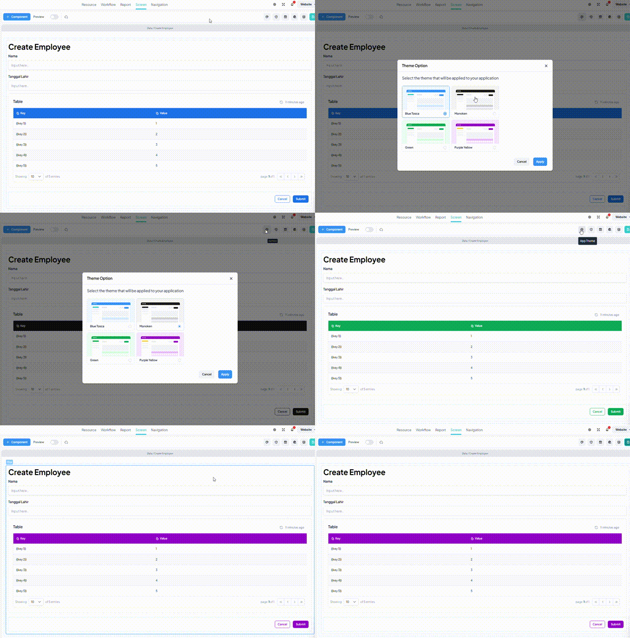
The App Theme feature allows users to globally customize the color scheme of the UI components throughout the entire application. It offers the flexibility to style the application's look to suit various preferences or branding needs.
Overview
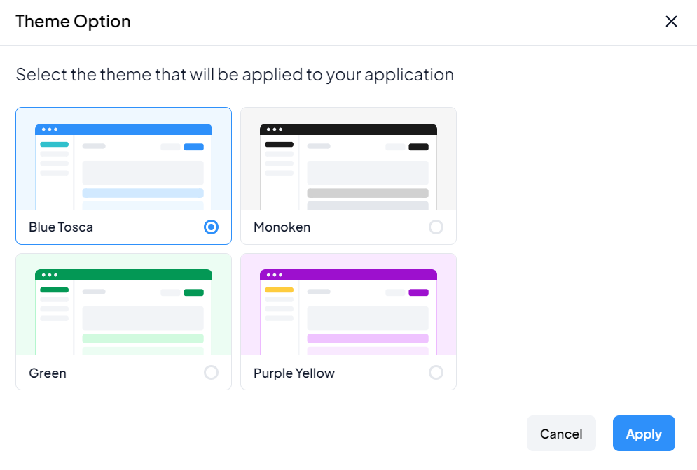
The App Theme feature allows users to select from predefined theme options, each defining a unique color palette for the UI:
Available Themes
-
Blue Tosca Theme:
- Primary Color: Blue
- Secondary Color: Tosca
-
Monoken Theme:
- Primary Color: Black
-
Green Theme:
- Primary Color: Green
-
Purple Yellow Theme:
- Primary Color: Purple
- Secondary Color: Yellow
Users can choose a theme that best suits the desired aesthetic or design language for their application.

Key Features
Global Application Theming
- Changes made to the theme apply globally across the entire application, ensuring a consistent look and feel.
Predefined Color Palettes
- Each theme is defined by specific primary and secondary colors, simplifying the customization process.
Simplified Styling
- Users can quickly modify the entire application's color scheme without the need for individual component-level adjustments.
How to Use App Theme
To use the App Theme feature:
-
Access Theme Settings:
- Navigate to the application settings or theme customization section.
-
Select Theme:
- Choose one of the available themes from the provided options.
-
Apply Changes:
- Save or apply the selected theme to update the application's appearance.

Customization Options
While predefined themes are available, users may have additional customization needs:
- Custom Themes:
- Advanced users can create custom themes by defining specific color configurations.
Limitations
It's important to consider the following limitations of the App Theme feature:
- Global Scope: Theme changes affect the entire application and cannot be applied selectively to individual pages or components.